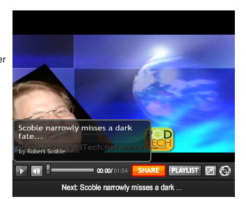
 I just visited Robert Scoble’s page where he is “attacked” by a robotic helicopter. I get buffering on the video and guess what? The buffering message covers what may be the most important part of the video, his advertisers’ logos. This gives some reason to question a lower left layout for video. Perhaps an upper right placement of logos would be better? What do you think?
As a designer on the web we are constantly faced with questions from traditional print designers. Why can’t we control every element? How come it looks different on this screen or that browser. Video is no exception, you need to think about the medium and consider placement to maximize your screen — taking into account things like the buffering messages. Sure some people are at such high speeds that they may not buffer. Others, not so much as is shown by the screenshot above.


April 10th, 2020 at 9:39 pm
We are following your website posts.
Please keep on posting and sharing great ideas.
Cosmetic Dentist in Red Deer